Lesson 1 Review Exam
Lesson 1 Review Exam
Lesson 1 Activity
Lesson 1 Activity

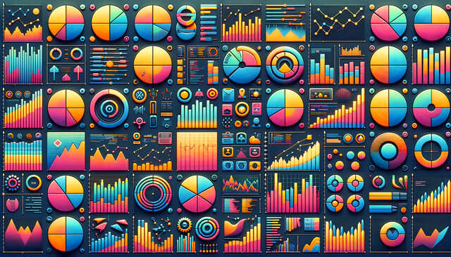
See Data in New Dimensions

Imagine transforming data into vibrant stories that captivate and inform. Our Data Visualization Techniques course invites you to master the art of turning numbers into compelling visual narratives. Dive into a world where charts pulse with clarity and graphs speak volumes, reshaping how data is understood and acted upon. From interactive storytelling with Matplotlib to the dynamic power of D3.js, you'll craft visuals that resonate with any audience. Your skills will transcend traditional presentations, equipping you with insights that drive decisions and inspire change. Join us to revolutionize your data communication, becoming a visionary in the modern era of information. Enroll now and discover the transformative power of visualization.
Data Visualization Techniques: Your Gateway to Transformative Insights
Imagine a world where data isn't just a stream of numbers, but a vibrant tapestry of stories waiting to be uncovered. Welcome to the world of Data Visualization Techniques--where your journey transforms raw data into a compelling visual experience, enabling you to communicate complex insights effortlessly.
In today's information-driven era, the ability to communicate data visually is as crucial as the data itself. Think about the last presentation you attended where data was presented in a flat, uninspiring format. Now envision the opposite: a presentation where every chart pulses with clarity, every graph beckons attention, and each dashboard speaks volumes without uttering a single word. That's the transformative power of data visualization, and this course is your stepping stone toward mastering this art.
From the moment you enroll, you'll delve into a rich ecosystem of visualization techniques that turn data comprehension into an intuitive, interactive experience. The course is not merely a sequence of lessons--it's a narrative journey where each module unveils new possibilities. You will discover how the nuances of color, shape, and layout can redefine not only how you present data but how your audience understands and acts upon it.
Picture yourself decoding the mysteries of geospatial data--not by wading through complex datasets, but by transforming them into vibrant heatmaps and choropleth maps. You'll learn to tell stories where geography becomes the backdrop to insights that drive change, illuminating paths for urban planners, environmental activists, and business strategists alike.
As you progress, you'll meet Matplotlib and D3.js--tools not merely for crafting graphs but for pioneering data-driven narratives that captivate and inform. You'll learn to harness the power of these tools, turning every interaction with your data into an opportunity for storytelling and connection. With them, you'll discover how to craft interactive visualizations that strike a perfect balance between aesthetic allure and analytical depth.
But data visualization isn't just about creating beautiful graphics--it's about conveying a message that resonates deeply with the audience. This course guides you in understanding your audience's unique needs, tailoring every visualization to evoke understanding and action. Whether you're creating dashboards for strategic planning or crafting infographics to sway public opinion, you'll possess the skills to make your data speak powerfully and persuasively.
As you navigate through Tableau and Power BI, you'll redefine what it means to collaborate through data. These platforms are your allies in transforming complex data sets into dynamic visuals that both individuals and teams can effortlessly interpret. With real-time updates and seamless integration capabilities, you'll lead projects with unprecedented efficiency and insight, positioning yourself as an indispensable asset in any data-driven endeavor.
Moreover, this course equips you with cutting-edge anomaly detection techniques. Imagine having the foresight to identify anomalies in real time, providing proactive solutions before issues snowball--a skill as valuable as the insights it uncovers.
The journey culminates in synthesizing all that you've learned into audience-centric strategies that transcend traditional data visualizations. You will craft narratives that demystify data, turning abstract figures into actionable insights. By the end of the course, audiences won't just absorb your data; they'll live it, understand it, and use it to make decisions that matter.
Our Data Visualization Techniques course is more than an educational experience; it's an invitation to redefine your relationship with data, transforming it from static statistics to compelling stories of impact. Join us, and emerge as a visionary who doesn't just convey data, but one who inspires understanding and change. The time is now--embark on your journey where data comes alive, and every insight is an opportunity awaiting discovery.
Choose from plans starting at just $16/month (billed annually)
Empower your team instantly with an integrative group enrollment system. Purchase licenses in bulk with Group Discounts.