In cases where values occur many times, we can use frequencies to more concisely represent data sets. Frequencies also allow us to deal with data that have been grouped (or "binned") into discrete ranges.
Key Terms
o Frequency
o Frequency table
o Absolute frequency
o Relative frequency
o Cumulative frequency
o Cumulative relative frequency
o Bar Graph
o Histogram
Objectives
o Create frequency tables to represent data sets
o Calculate relative, cumulative, and cumulative relative frequencies
o Create and interpret bar graphs and histograms
Let's Begin!
Depending on the type of data being analyzed, a data set may or may not include multiple instances of the same value. For example, a scientist making very precise measurements in an experiment may never see the same number twice. His data might appear something like the data set shown below.
{1.0362, 1.0410, 1.0397, 1.0318, 1.0415, 1.0401, 1.0379}
In such a case, the best approach to calculating values such as the mean and variance is to use the formulas we discussed in the preceding articles. On the other hand, sometimes a data set includes multiple instances of the same value. A statistician considering whether a six-sided die is "fair" might roll the die multiple times and come up with a data set like the one below.
{5, 6, 3, 4, 1, 2, 6, 5, 4, 6, 1, 3, 6, 4, 1, 5, 3, 2, 6, 1}
When the same value occurs multiple times in a data set (especially if the set is large), the data can be expressed and analyzed in a much more compact manner using frequencies.
Introduction to Frequencies
A frequency is the number of times that a particular data value occurs in a data set. For example, if we take the second example data set from above and order the values from smallest to largest, we see clearly that each value occurs multiple times.
{1, 1, 1, 1, 2, 2, 3, 3, 3, 4, 4, 4, 5, 5, 5, 6, 6, 6, 6, 6}
One way to represent such data sets is by way of a frequency table, which lists the data values in one column and their corresponding frequencies (also called absolute frequencies) in another column. The frequency table for the example data set above is shown below.
|
Data Value |
Frequency |
|
1 |
4 |
|
2 |
2 |
|
3 |
3 |
|
4 |
3 |
|
5 |
3 |
|
6 |
5 |
Another useful tool in statistics and probability is the relative frequency, which is the ratio of the number of times a value occurs in a particular data set to the total number of values in that set. Continuing with our example set, the total number of values is the sum of the numbers in the frequency column: 20. The relative frequency of each value is its frequency divided by 20, in this case.
|
Data Value |
Frequency |
Relative Frequency |
|
1 |
4 |
0.2 |
|
2 |
2 |
0.1 |
|
3 |
3 |
0.15 |
|
4 |
3 |
0.15 |
|
5 |
3 |
0.15 |
|
6 |
5 |
0.25 |
Interestingly, we can note that the relative frequency of a particular data value is the same as a probability (assuming that the data set corresponds to a population). If we were to write each value on a piece of paper and toss all the papers into a bag, then the probability of choosing a particular value at random from the bag is equal to the relative frequency of that value.
In addition, statistical and probability distributions often make use of the concepts of cumulative frequency and cumulative relative frequency. The cumulative frequency of a particular value x is the frequency of all values less than or equal to x. Thus, the cumulative frequency of the value 3 in our example above is 3 + 2 + 4 = 9. Similarly, the cumulative relative frequency of a particular value x is the sum of the relative frequencies of all values less than or equal to x. Note that the cumulative relative frequency is also the same as the cumulative frequency divided by the total number of values in the set (20, for our example data). We add additional columns to our example frequency table to illustrate the cumulative and cumulative relative frequencies.
|
Data Value |
Frequency |
Relative Frequency |
Cumulative Frequency |
Cumulative Relative Frequency |
|
1 |
4 |
0.2 |
4 |
0.2 |
|
2 |
2 |
0.1 |
6 |
0.3 |
|
3 |
3 |
0.15 |
9 |
0.45 |
|
4 |
3 |
0.15 |
12 |
0.6 |
|
5 |
3 |
0.15 |
15 |
0.75 |
|
6 |
5 |
0.25 |
20 |
1.0 |
Practice Problem: Use the data set below to create a frequency table that also includes the relative, cumulative, and cumulative relative frequency for each value.
{22, 30, 21, 28, 29, 29, 22, 25, 29, 21, 30}
Solution: First, order the data set from least to greatest; this allows you to approach the problem in an orderly manner and to easily see how many instances of each value are in the set.
{21, 21, 22, 22, 25, 28, 29, 29, 29, 30, 30}
Next, create the table with five columns and fill in each column appropriately. The frequency is the number of times the data value occurs in the set, and the relative frequency is the frequency divided by 11 (the total number of values in the set). The cumulative frequency for a value x is the sum of the frequencies of all values less than or equal to x, and the cumulative relative frequency is the cumulative frequency divided by 11.
|
Data Value |
Frequency |
Relative Frequency |
Cumulative Frequency |
Cumulative Relative Frequency |
|
21 |
2 |
0.182 |
2 |
0.182 |
|
22 |
2 |
0.182 |
4 |
0.364 |
|
25 |
1 |
0.091 |
5 |
0.456 |
|
28 |
1 |
0.091 |
6 |
0.545 |
|
29 |
3 |
0.273 |
9 |
0.812 |
|
30 |
2 |
0.182 |
11 |
1.0 |
Although frequencies are best explained in terms of data sets that contain multiple instances of specific values, frequencies can also be used with data sets in which all the values are unique (each value has an absolute frequency of unity). If we group data values into "bins," which correspond to ranges of numbers, then we can apply what we discussed above. For example, if we are dealing with decimal values between 0 and 10, we might group the data into bins corresponding to values between 0 and 1, between 1 and 2, and so on.
Bar Graphs and Histograms
A convenient method of representing data sets using frequencies is the bar graph (and its close cousin, the histogram). Although these two terms are sometimes used interchangeably, they can are sometimes differentiated. A bar graph (or bar chart) represents the frequency of a data value as a corresponding height of a bar, which is usually drawn vertically. A bar graph of the example data from earlier in the article is shown below.
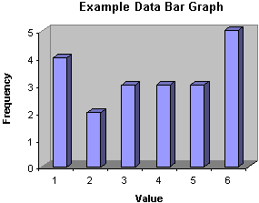
A histogram is similar to a bar graph, except that the width of the bars corresponds to the range of values (when using bins instead of discrete values). If the "widths" of the bins are all equal, then the histogram will look just like a bar graph.
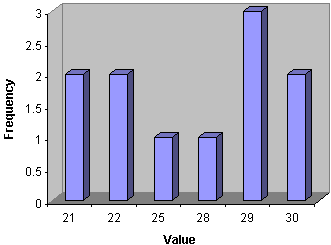
Practice Problem: Create a bar graph for the frequency results from the first practice problem of this article.
Solution: Use the frequency table you made for the first problem; the bars of the graph will have heights proportional to the frequencies for each value.
Calculating Descriptive Statistics Using Frequencies
Assume that the hypothetical statistician mentioned earlier in the article wanted to calculate some descriptive statistics for the data he collected when rolling the six-sided die. He could, for instance, calculate the mean and standard deviation of the data using the formulas from our previous articles, but an easier approach would involve using frequencies, by which he can represent the example data set using 12 numbers (6 data values and 6 corresponding frequencies) instead of 20 (20 data values).
Let's rewrite the formula for the arithmetic mean using frequencies; note that instead of writing the summation , as the addition of each data value, we write it as the addition of each unique value multiplied by the number of times it occurs in the set (i.e., its frequency). We write the frequency of value xi as fi. Note that N in this case is defined as the number of unique data values, not the sum of the frequencies fi. Thus, a general data set would be {x1, x2, x3,., xN} with corresponding frequencies {f1, f2, f3,., fN}. Our example data for the six-sided die would then be {1, 2, 3, 4, 5, 6} with frequencies {4, 2, 3, 3, 3, 5}.

The numerator of the expression is the sum of the unique data values, each multiplied by its frequency. The denominator is the sum of the frequencies, or the total number of values in the full data set. Let's show that we get the same result for the arithmetic mean using this expression and using our expression from the first article. First, we'll use the new formula.

![]()
Now, let's use the original formula with the full data set {1, 1, 1, 1, 2, 2, 3, 3, 3, 4, 4, 4, 5, 5, 5, 6, 6, 6, 6, 6}.
![]()
The results are identical. Likewise, the formulas for the population variance (σ2) and skewness (γ) are the following. (The standard deviation is still the square root of the variance.)


Note that the kth moment about the mean, written in terms of frequencies, is

Thus, the variance and skewness are still written in terms of the second and third moments about the mean, respectively. (For sample data, simply subtract unity from the sum in the denominator to get the corresponding estimator as discussed in the previous article.)
Practice Problem: Calculate the (arithmetic) mean and standard deviation for the data set shown below.
{22, 30, 21, 28, 29, 29, 22, 25, 29, 21, 30}
Solution: This data set is the same as the one from the first practice problem of this article. Refer to the frequency table in that problem for the frequencies of each data set. We can use the formulas from above to calculate the mean and variance as shown below.


Using this mean, we can now calculate the variance and then standard deviation.

![]()
![]()


