Take a moment to glance over the section titles in this article. The two titled "Creating Reports" and "Creating Charts and Graphs" might stand out. They may even make you a little nervous. They sound labor-intensive, don't they? If that is what you're imagining, you can relax, because nothing could be further from the truth. In fact, the name is a bit of a misnomer; you don't actually have to create reports, charts, or graphs in Quicken Deluxe 2010. The software does it all automatically. All you have to do is click a button and select your desired parameters. A better way to say it would be "viewing reports, charts, and graphs."
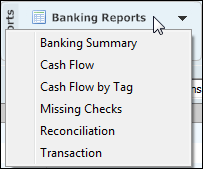
The Reports button is available in the action bar of every tab except Bills. Below is an example of what it looks like.
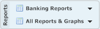
This example was taken from the Banking tab. If you were on the Investments tab, the upper button would read Investment Reports, and if you were on the Planning tab, it would read Spending Reports. By clicking this button, you will see only the reports and graphs associated with that particular tab, as in the example below.
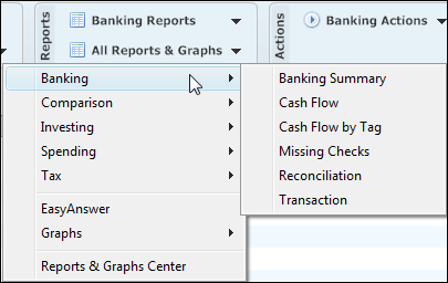
However, you can access all of the reports and graphs available in Quicken Deluxe 2010 by clicking the second button and selecting the desired category:
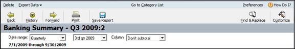
We'll go ahead and click on Banking Summary so we can see the basic report screen and discuss the various options associated with it.
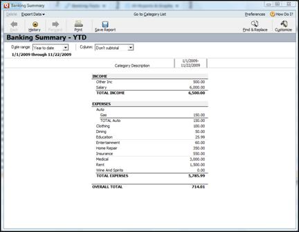
In the upper left-hand corner of the screen, is the Export Data button. You can use this button to export your report to Excel, PDF, or simply copy it to the clipboard so that it can be pasted into another program.
The Go to Category List button in the center of the toolbar launches the Category List panel.
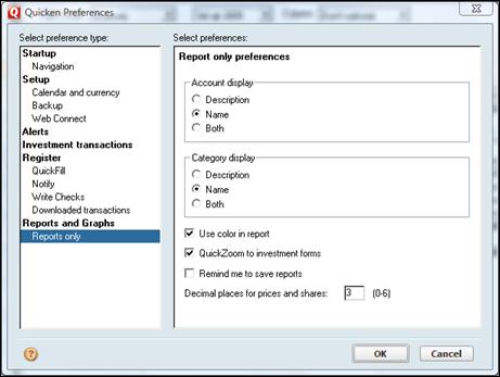
Use the Preferences button at the far right of the toolbar to launch the Quicken Preferences screen. You can also access the Quicken Preferences screen by clicking Edit > Preferences > Quicken Preferences and then selecting Reports and Graphs or Reports Only. When you click the Preferences button in the Reports screen; however, the Reports and Graphs portion will automatically be selected, as in the example below.
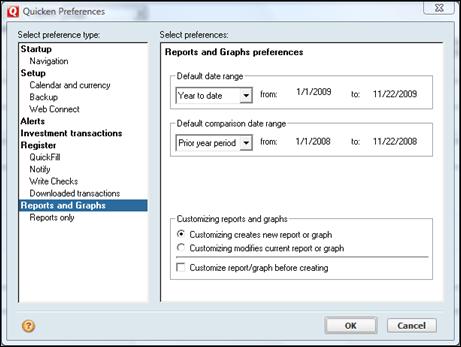
From this screen, you are able to set your own default preferences. For instance, you can set the date range, the comparison date range, and let Quicken know how you want it to respond when you customize a report or graph. These options are self-explanatory, but it's best if you take a moment to examine the various drop-down menus and then see how selecting one or more of them may affect the final look of your reports. You may prefer something different than the out-of-the-box default, but you'd never know that unless you experiment with the various settings.
Now take a second look at the box at the bottom of the Preferences screen. It's labeled Customizing reports and Graphs. In our example, Customizing Creates New Report or Graph is selected. This means that any time you alter a report or graph, Quicken automatically creates an entirely new instance. This is convenient if you'd like to go back and compare the two versions.
Below is an example of an Action bar from our report. With Customizing Creates New Report or Graph selected, we've altered our report a number of times. The different instances are accessible by clicking the Back  button, the Forward
  button or the History
  button.
If there is only one instance of a report, these buttons are faded and unusable.
So now let's go back to the Preferences screen and select Reports only. The screen will now look like this:
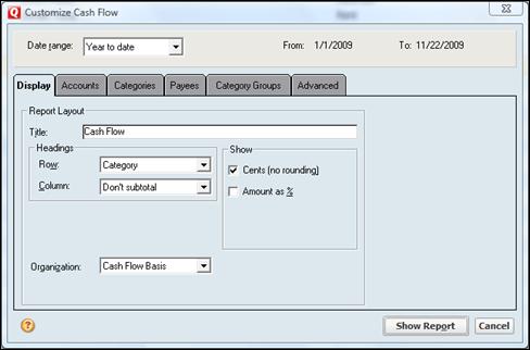
To learn how to modify reports, click Banking Reports > Cash Flow. This will launch a dialogue box that looks like this:
We're now going to look at the options available to us on each tab.
Display
We can also change what is displayed in the Rows or Columns. However we can only select a value from one of the dropdown menus, and we cannot enter an arbitrary one.
Choose an organization method. There are three options: Income Expense, Cash Flow Basis, and Category Group.
Accounts
Use this tab to select the account groups you'd like Quicken to use to build the report. You can even choose to display hidden accounts.
Categories
Use this tab to select the categories you'd like to use in your report.
Payees
This tab allows you to select or exclude certain payees from your report.
Category Groups
Use this tab to select or exclude an entire group of categories.
Advanced
Use this tab to further fine-tune your report. You can specify an amount, include unrealized gains, use tax-related transactions, and transaction types. You can also choose to include or exclude all transfers, and subcategories.
Use the selections in the Status box to include items that have not cleared, newly cleared, or have been reconciled.
Charts and graphs are great tools for seeing at a glance who's getting the biggest piece of your pie. In Quicken Deluxe 2010, creating them is just as easy as creating reports. In fact, the process for doing both is almost identical.
Take another look at the Reports button in the Action bar.
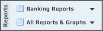
To see a selection of the Graphs available to you, click All Reports & Graphs > Graphs.
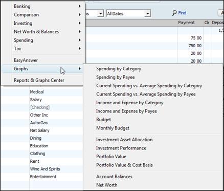
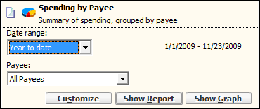
Some selections will create pie graphs, while others will create line charts. We'll choose Spending by Category.
As you can see in the example below, the dialogue box is nearly identical to the ones we used to create our reports. In fact, you can even create a report using the criteria you specify here.
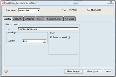
Since the options on these boxes are so closely related to the ones we used to create our reports, we won't go over them again. Instead, we'll go ahead and click the Show Graph button.
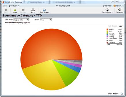
As you can see, the information is presented in an easy to understand pie chart. In addition to the legend to the right, you can just hover your mouse pointer over a color in the chart. The pointer will turn into a magnifying glass symbol and then show you what the color represents, as well as its amount.
Another way to create, view, and manage your reports and graphs is through the Reports and Graphs Center.
To launch the Reports & Graphs Center, click All Reports & Graphs > Reports & Graphs Center.
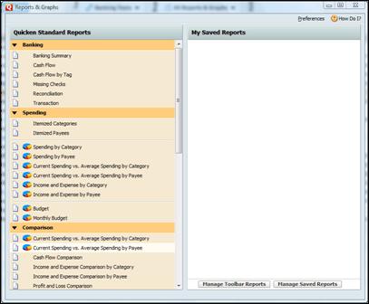
This screen shows you all of the reports and graphs available to you in Quicken Deluxe 2010. By clicking a title, you can set a few quick parameters, such as the date range, or launch the Customize dialogue box.
You can also use this screen to manage your reports.