Sparklines are visual representations of data that appears embedded within a cell in a worksheet.
In this article, you will learn:
-
How to create a sparkline
-
How to change the color and style of a sparkline
-
How to deal with missing or hidden data in sparklines
-
How to group sparklines together to compare data
-
How to remove a sparkline
Creating a Sparkline
Let's start out with a quick review of how to create sparklines to represent data that you have entered into a worksheet.
To create a sparkline in Excel 2013, start out by clicking on the cell where you want a sparkline to appear, as we've done below.

Go to the Insert tab and find the Sparklines group. Next, select Line.

You will then see the Create Sparklines dialogue box.
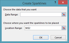
Now select the data that you want represented in the sparkline by highlighting those cells in the worksheet (as shown in the next image).
In our example, the sales monthly history for our employee named "Smith" is shown. We want our sparkline to be a graphical representation of Smith's sales history. We've highlighted the sales for each month.

Click the OK button in the dialogue box.
As you can see below, the sparkline appears in the cell that you specified. Notice that the sparkline represents the sales trends as Smith's sales fluctuated from month to month.

There are three different types of sparklines that you can add in Excel. They are line, column, and win/loss.
Customizing Sparklines
Once you have added sparklines to a worksheet, you can then alter the design of those sparklines to adhere to the look and feel of your worksheet � or to better suit the data that they represent.
Notice that in the snapshot below that we have added three sparklines.

When we click on the cell that holds the sparkline, the Design tab will appear in the ribbon.
It looks like this:

From the Design tab, we can change the type of sparkline that appears in our worksheet. As you can see, we currently have Line selected. We can also switch to Column or Win/Loss.
We can also choose to apply the change to one or all sparklines. To apply it to all sparklines, simply select them all.
Below are column sparklines.

In the next snapshot, you can see win/loss sparklines:

The default color of all sparklines that you add is blue.
To change the color, select the sparkline(s), then go to the Style group under the Design tab.

Click on a color to change it.
We've changed ours to purple.

For more colors or to change the weight of a line sparkline, you can also go to Sparkline Color.
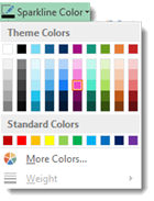
In addition, you can choose to apply a different color to the high point in our sparkline � as well as the low point.
To do this, go to the Show group, then put a checkmark beside the data point you want to highlight by applying a different color.

Select:
-
High Point to have the highest data value highlighted.
-
Low Point to have the lowest data value highlighted.
-
Negative Points to indicate negative values.
-
First Point to highlight the first data value.
-
Last Point to highlight to last data value.
-
Markers to mark data points in a Line sparkline.
Take a look at our column sparklines with the high point highlighted:
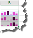
And the low point:

The first point:

And the last point:

You can also change the highlight color for the points, by going to Marker Color, then selecting the point:
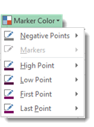
Followed by a color:

Let's go back to the Show group under the Design tab. This is where we selected a data point to highlight.

Notice that Markers was greyed out. Markers only becomes an active option with line sparklines.
If we change the type of sparkline back to line, we will see that it becomes active:

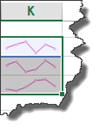
When we put a checkmark beside markers, Excel places points for each set of data represented in our sparkline(s):
Dealing with Empty or Hidden Cells in a Sparkline
If there are data values missing within the range that you've specified for a sparkline, you will see it visualized in your sparkline.
Using our spreadsheet as an example, we've deleted the data value for the month of February for the employee named Smith.
When this happens, the sparkline is interrupted, as shown below.

Because we have the data points visualized (by checking Markers in the Show group under the Design tab), we can see the first data point. However, if we didn't have the data points visualized, you would likely not even see the data that comes before March, the point where the sparkline resumes after the empty cell.
Take a look below:

That said, you can specify how Excel deals with empty cells and missing values.
To do this, go to the Design tab again. Click the Edit Data button:
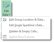
Select Hidden & Empty Cells.
You will then see the Hidden and Empty Cells Settings dialogue box.

Choose an option.
-
Gaps makes it so that if a value is missing, there won't be a connecting line displayed.
-
Zero makes it so that when a value is missing, it will be displayed as if the value was 0.
-
Connect Data Points makes it so that the missing value is ignored. The existing values will be connected with a line. However, this option is only available with line sparklines.
-
Show Data in Hidden Rows and Columns means Excel displays the value even when rows or columns that contain that value are hidden.
Click OK when you're finished.
Comparing Sparklines in a Group
Take a look at our sparklines in the snapshot below.

As you can see, we have chosen the column type sparklines. We also have the high points highlighted so that the highest data value in each range appears as black bar instead of purple.
-
In the Smith row, the high point represents 21.
-
In the Jones row, the high point represents 26.
-
In the Alexander row, the high point represents 22.
We want a way to compare the data that's represented in all sparklines. In other words, we want a way to compare all the sparklines.
The first thing we need to do is group these sparklines together. To do this, select all the sparklines, then go to the Design tab.
Click on the Group button.
As you can see, when sparklines are grouped together, a blue border will appear around all the sparklines in the group when you click on one of the sparklines. We clicked on the sparkline in the Alexander row, and a blue border appeared around all the sparklines that we grouped together.

To compare the sparklines, go to the Design tab and click on the Axis button.
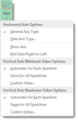
Look under Vertical Axis Minimum Value Options in the Axis dropdown menu (pictured above).
As you can see, it is set automatically for each sparkline.
The same is true for Vertical Axis Maximum Value Options.
To be able to compare values in the sparklines, we need to change this to Same for All Sparklines for both the minimum and maximum value options.
By doing this, you can compare the sparklines in the group.
Take a look at our sparklines below.

We can now see that Jones has the highest data point of all three employees, followed by Alexander, then Smith.
Now you can compare the values in the sparkline to the entire group of sparklines, rather than just the data values that an individual sparkline represents.
Removing Sparklines
To delete a sparkline, simply select the sparkline or group of sparklines that you want to delete.
Click the Clear dropdown menu under the Design tab.

Select if you want to clear the sparklines that you've selected, or clear the selected sparkline groups.


